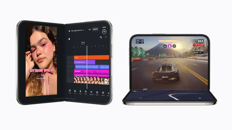
Huawei Launches Tri-Fold Mate XT 2? On September 7, 2026, Huawei officially unveiled its latest tri-fold flagship, the Mate XT 2, featuring the custom Kirin 9050 Pro processor and HarmonyOS 7.0. The commercial introduction of this multi-folding hardware marks a significant transition toward dynamic-screen mobile computing. For software engineers and interface designers, moving from a standard 6.5-inch cover screen to an expansive 10.2-inch 3K canvas introduces complex architectural requirements: application layouts must reflow responsively, window state must remain continuous across dynamic folding actions, and navigation flows must adapt to multi-window multitasking without losing user context.
Core Industry Realignment: The Huawei Launches Tri-Fold Mate XT 2 Hardware Architecture
At a Glance
- The handset introduces a dual-hinge G-shaped inward-folding mechanism, measuring 12.3mm when closed and tapering to 3.5mm at its thinnest unfolded edge.
- It features the Kirin 9050 Pro processor built on LogicFolding vertical circuit layering, alongside an optional hardware-level dual-pixel privacy screen.
- Domestic retail pricing is set at 19,999 yuan for the base 16GB/256GB configuration, scaling to 29,999 yuan for the 2TB custom stylus bundle.
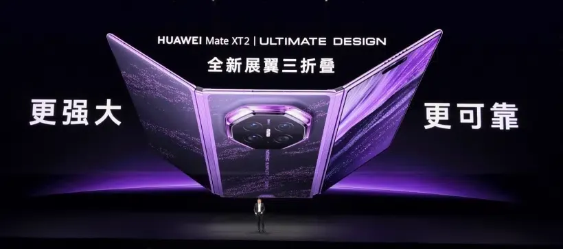
The physical construction of the Mate XT 2 represents a major evolution in flexible display engineering. Moving from the predecessor’s Z-shaped inward-and-outward folding architecture to a G-shaped inward-folding design, the device encases its primary folding screen safely inside when closed. The external cover display features a 6.5-inch LTPO OLED panel with a 2442 x 1140 resolution, protected by Xuanwu Kunlun glass. When fully opened, the internal flexible OLED panel expands into a 10.2-inch 3K display with a 2232 x 3184 resolution and an expansive 12.8:9 aspect ratio, as detailed in the official HUAWEI Mate XT 2 specifications.
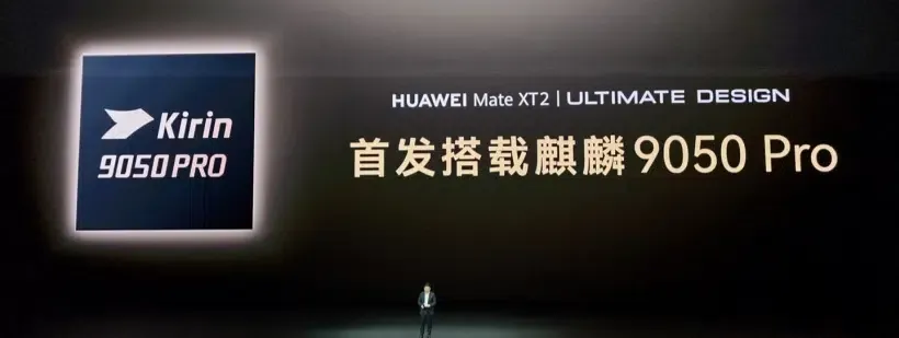
Under the hood, the device runs on the Kirin 9050 Pro chipset. Huawei describes the Kirin 9050 Pro as its first LogicFolding “τ” chip, utilizing vertically layered logic units and shorter interconnect paths to improve processing efficiency. According to detailed launch reporting by IT Home, the processor achieves a 42% overall performance improvement over prior silicon, with single-core throughput increasing by 24% and multi-core processing expanding by 52%. Graphics workloads are driven by the Ma Liang GPU supporting real-time ray tracing, while the Da Vinci NPU accelerates on-device Mixture-of-Experts (MoE) models up to 30 billion total parameters.
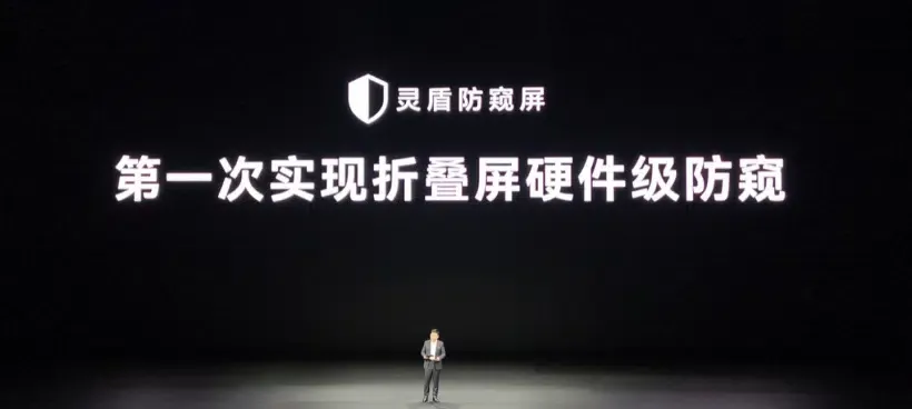
Durability is reinforced through a multi-layer composite inner screen structure, which improves impact resistance by 200%, alongside IP58 and IP59 certifications for dust and water ingress protection. The optional Lingdun privacy display variant introduces an independent dual-pixel structure that narrows the horizontal viewing angle on demand, shielding on-screen information from lateral observation. Reuters covered the launch in the context of intensifying competition in China’s premium foldable market. Taken together, the device’s mechanical, display, and processor changes provide a useful new reference point for flexible-device engineering.
Under-the-Hood Mechanics: HarmonyOS 7 Window Geometry and State Continuity
Operating across a tri-fold device breaks traditional assumptions regarding static viewports and fixed aspect ratios. On standard single-screen smartphones, applications initialize within a fixed display boundary and maintain that visual container until dismissed.
On a tri-panel system running HarmonyOS 7, an application operates across three distinct display states: a 6.5-inch single-screen phone mode, a dual-panel split canvas, and a 10.2-inch fully unfolded workstation supporting up to three concurrent applications side by side. When a user unfolds the device mid-task, the operating system shifts the window geometry, allowing applications to respond through HarmonyOS window lifecycle and size-change APIs instead of treating the geometry change itself as a mandatory full restart.

Architectural Flow: Maintaining UIAbility and WindowStage State
In the HarmonyOS application framework, interfaces are managed through UIAbility components and WindowStage containers. As documented in the HarmonyOS multi-device layout architecture, applications should not treat every fold or unfold event as a destructive restart. Instead, applications can respond to relevant window-size or window-status changes, using callbacks such as windowSizeChange and windowStatusChange where appropriate, adapting component trees dynamically to the available screen bounds.
The diagram below outlines the runtime lifecycle and state management flow across dynamic folding states:
[6.5" Single-Screen Viewport]
  User Session ──> UIAbility Active (Single Window Layout) ──> Local State Managed in Memory

[Dynamic Tri-Fold Unfolding (10.2" 12.8:9 Canvas)]
  Hinge Unfolds ──> Window Size Changes ──> App Receives windowSizeChange ──> Adaptive Layout Reflow ──> App Preserves Required UI State ──> Continuity Maintained

[HarmonyOS 7 Free Multi-Window Mode]
  Task Dock Trigger ──> 3-Way Split Requested ──> Window Geometry Updated ──> App Adjusts Layout for Available Window Bounds ──> Multi-Tasking Flow Maintained
Huawei’s official Foldable Screen UX Design Guidelines emphasize preserving scroll position, active input, and playback progress across display transitions. Developers should separately ensure that application-specific navigation structures adapt cleanly as additional screen space becomes available, ensuring split-view navigation stacks reflow naturally across expanded columns.
Cross-Screen Layout Strategies and External App Entry
To support dynamic screen geometry, development teams must adopt responsive design principles based on dynamic breakpoint systems rather than hardcoded pixel dimensions. Using flexible column grids, adaptive margins, and multi-window dock listeners ensures that applications utilize the expanded 10.2-inch canvas effectively.
The table below outlines how different architectural mechanisms address distinct layers of the mobile application lifecycle:
| Mechanism | Primary Function | State Handled | Best For |
|---|---|---|---|
| HarmonyOS Adaptive Layouts | Responsive UI reflow | Window geometry & visual components | Screen fold/unfold transitions and multi-window resizing |
| UIAbility / WindowStage Lifecycle | App and window lifecycle coordination | Window & runtime lifecycle context | Managing presentation containers during orientation and window mode shifts |
| App-Managed State Persistence | Preserve transient UI & application data | Input, scroll position, task & navigation state | Ensuring data continuity when window geometry changes dynamically |
| Huawei App Linking | Direct external-to-app routing | Destination URI & routing parameters | Launching installed native apps directly from external web links |
| Deferred Deep Linking (e.g. OpoInstall) | Store-to-app install context | Pre-install referral & campaign parameters | Preserving initial campaign context across app-store download boundaries |
Separately, while local window management resolves on-device fold transitions, external entry flows operate on a different system boundary. When an app is already installed, the Huawei App Linking documentation confirms that external web URLs route directly into native content views. If a separate acquisition flow crosses an app-store installation boundary before first launch, deferred deep linking can become relevant for restoring eligible pre-install campaign context. Platforms such as OpoInstall document this first-launch parameter-restoration pattern separately from on-device window management.
Engineering Implementation Checklist for Tri-Fold Devices
To ensure full compatibility with emerging tri-panel hardware, software teams should implement structured development practices across their design and engineering workflows.
Developer Implementation Checklist
- Listen for Window Geometry Callbacks: Listen for relevant
windowSizeChangeandwindowStatusChangeevents on the application window where appropriate, and adapt the layout to the resulting window bounds. - Implement Breakpoint-Driven Grids: Replace hardcoded layout dimensions with adaptive grid layouts that automatically switch between single-column, dual-column, and three-column master-detail views based on available width.
- Persist App-Specific Transient State: Persist app-specific transient state as appropriate—for example through HarmonyOS state-management facilities such as
LocalStorageorAppStorage—so that relevant inputs, scroll positions, and UI context can be restored when layouts change. - Validate External App Entry: Configure Huawei App Linking in AppGallery Connect to validate external-to-app routing independently of the app’s current window layout.
Product & Growth Strategy Checklist
- Design Multi-Pane Workspaces: Optimize core user journeys to take advantage of the 12.8:9 aspect ratio, displaying secondary tools, reference panels, or auxiliary data feeds side by side.
- Audit Form Factor Analytics: Track performance metrics across folding states to identify layout truncation or interaction friction specific to multi-window modes.
- Validate Store-to-App Conversion Paths: Ensure that acquisition funnels handle campaign parameters reliably when onboarding new users through app-store installation boundaries.
Adhering to these engineering guidelines allows applications to deliver stable, high-performance experiences while taking full advantage of the expanded multi-window capabilities of next-generation hardware.
Frequently Asked Questions (FAQ)
How does the Mate XT 2 G-shaped hinge differ from earlier foldable models?
How does HarmonyOS 7 maintain app continuity during fold transitions?
What is the difference between adaptive window layout and deep linking?
Key Takeaways for Engineering Teams
The arrival of production-ready tri-fold hardware represents a significant transition from fixed-viewport mobile design toward flexible, multi-window personal computing. As display boundaries expand on demand, applications must treat screen geometry as an elastic canvas rather than a rigid container. Engineering teams that build responsive breakpoint layouts, implement clean application-managed state preservation lifecycles, and establish robust external routing architectures will be better positioned to support emerging multi-window device classes.
References
-
Huawei Consumer Business Group. HUAWEI Mate XT 2 Specifications. https://consumer.huawei.com/cn/phones/mate-xt-2-ultimate-design/specs/
-
IT Home. Huawei Mate XT 2 Tri-Fold Flagship Launch Announcement. https://www.ithome.com/0/999/337.htm
-
Reuters. Huawei, Xiaomi Launch New Foldable Smartphones Ahead of Apple Event. https://www.reuters.com/technology/huawei-launches-new-foldable-smartphone-competition-with-xiaomi-apple-heats-up-2026-09-07/
-
Huawei HarmonyOS Developer Documentation. Foldable Screen UX Design Guidelines. https://developer.huawei.com/consumer/cn/doc/doccenter-ux-design/ux-guidelines-foldable-screen-0000001807866557
-
Huawei HarmonyOS Developer Documentation. Multi-Device Responsive and Adaptive Layout Architecture. https://developer.huawei.com/consumer/cn/doc/doccenter-dev-faq/faqs-multi-device-deployment-1
-
Huawei HarmonyOS Developer Documentation. App Linking Overview and Development Guide. https://developer.huawei.com/consumer/en/codelab/AppLinking-HarmonyOS/
-
OpoInstall Developer Documentation. Deferred Deep Linking Dynamic Parameter Restoration. https://www.opoinstall.com/zh/blog/deferred-deep-linking-parameter-restoration
Share this article